
Founder Portfolio · Brand Identity
Blackbird Melbourne
A premium identity for one of Melbourne’s most atmospheric dining destinations, balancing timeless elegance with a darker contemporary edge.
Blackbird Melbourne, Flinders Lane
Marketing Executive, Ghanem Group
Lead designer on the project.Brand identity, typography, visual system, menu design, campaign collateral and rollout
Identity system
A confident, elegant expression of premium dining.
The identity was built around a refined wordmark, using expressive script to introduce a sense of romance and movement. It gives the brand a human, crafted quality while still feeling polished in a premium venue context.
Supporting typography was kept clean and spacious, allowing the brand to move between quiet sophistication and richer, more expressive moments across menus, signage and promotional collateral.
Primary Wordmark & Submark

Alternate Logo Lockups




Colour Palette
Typography System
Canela Deck Light

Pinyon Script

Poppins

Graphic Devices


Venue presence
Designed to feel at home on Flinders Lane.
The brand needed to work beyond digital and printed assets. It had to hold its own in the physical environment, from the front-of-venue signage to the intimate interior setting.
The result is a system that pairs beautifully with the existing architectural details — dark, polished, quietly luxurious and intentionally restrained.
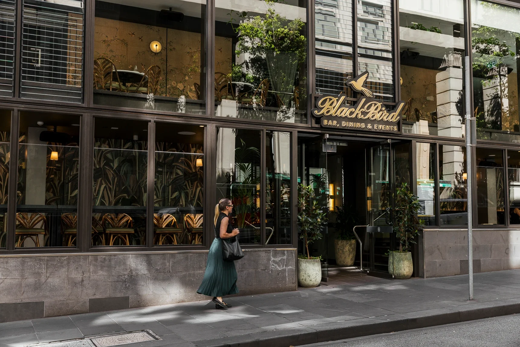
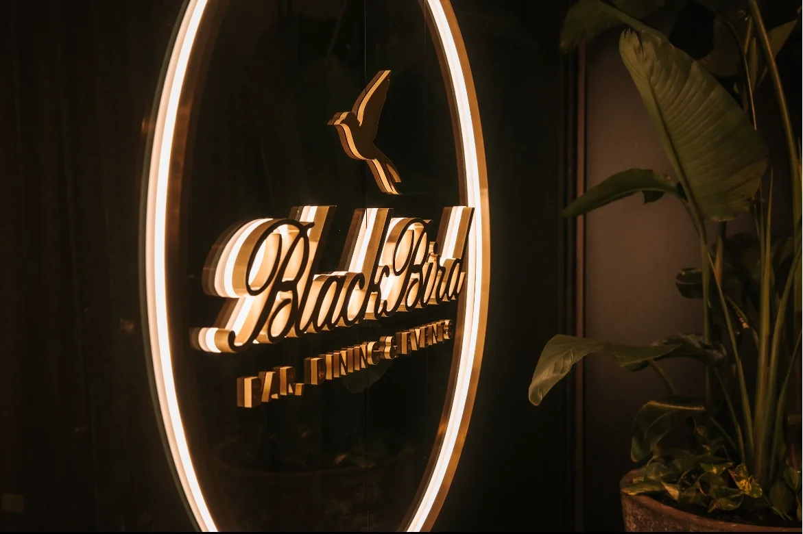
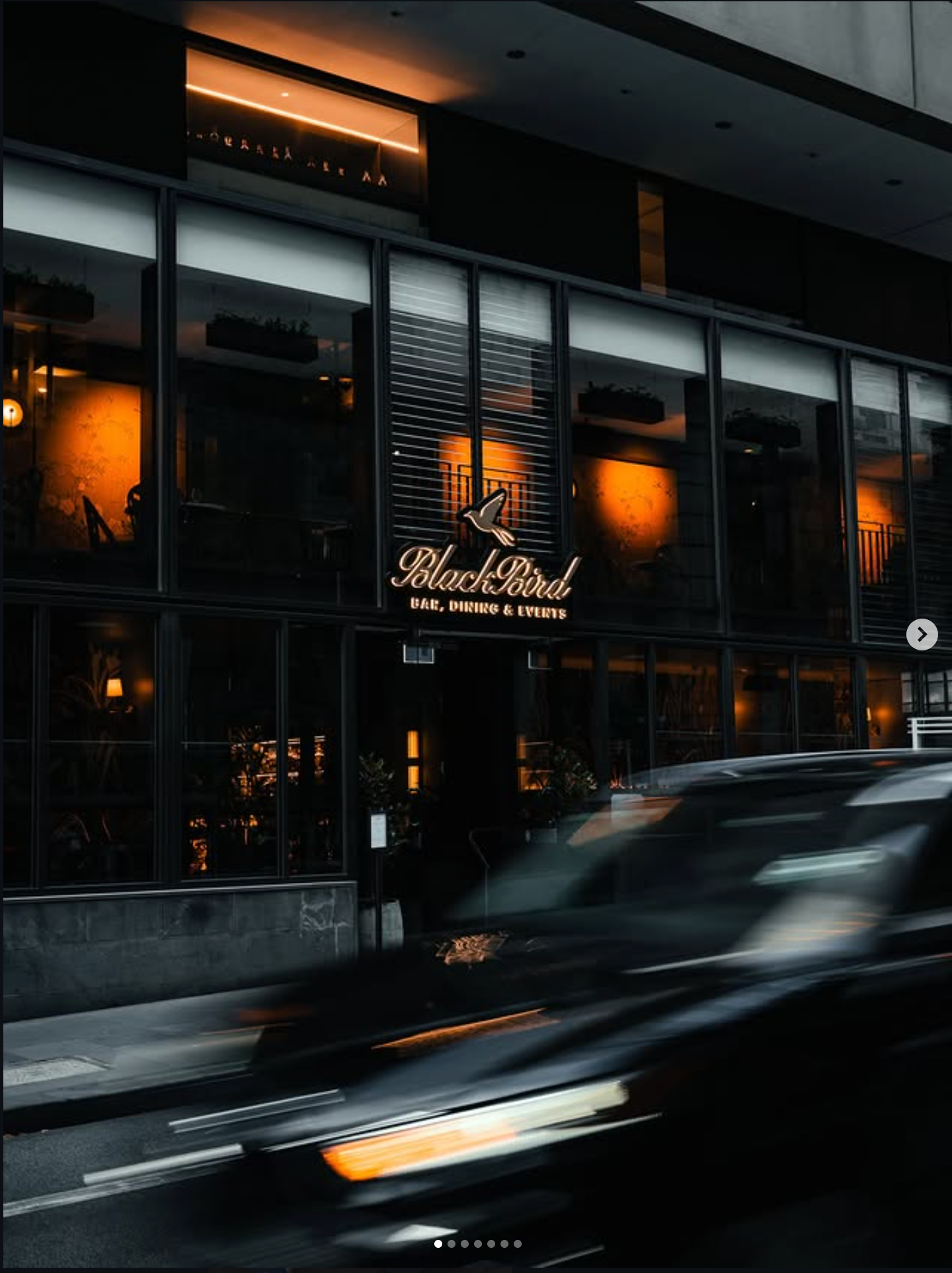
Exterior venue photography: Amy Hemmings, Lumea Photo.
Brand in use
Built for menus, moments and special events.
The identity was designed to extend naturally across the full hospitality experience, from core menu design to seasonal campaigns and premium event collateral.
Rather than relying on a single logo treatment, the visual system uses typography, colour and spacing to create a recognisable Blackbird atmosphere across every touchpoint.
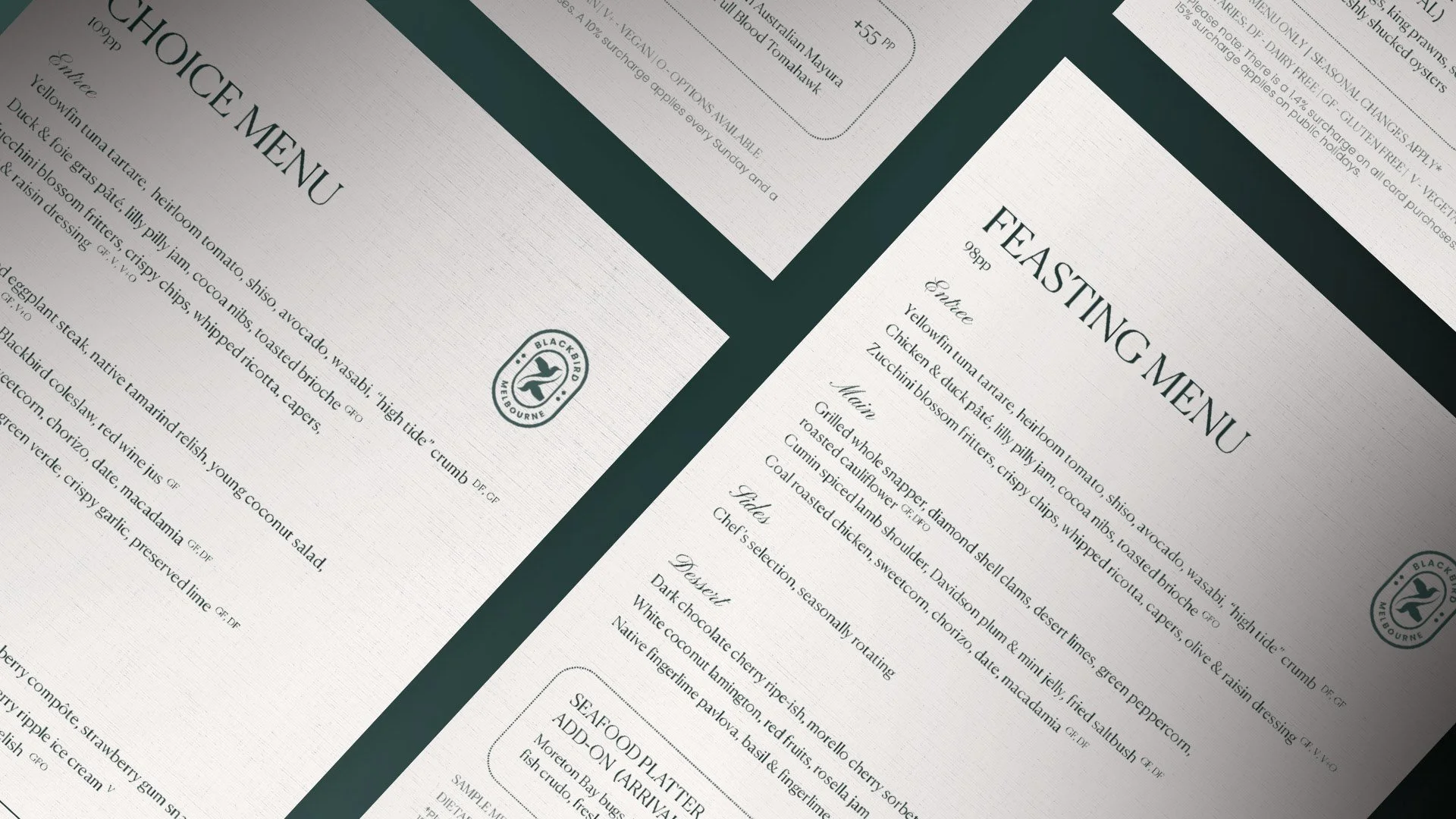
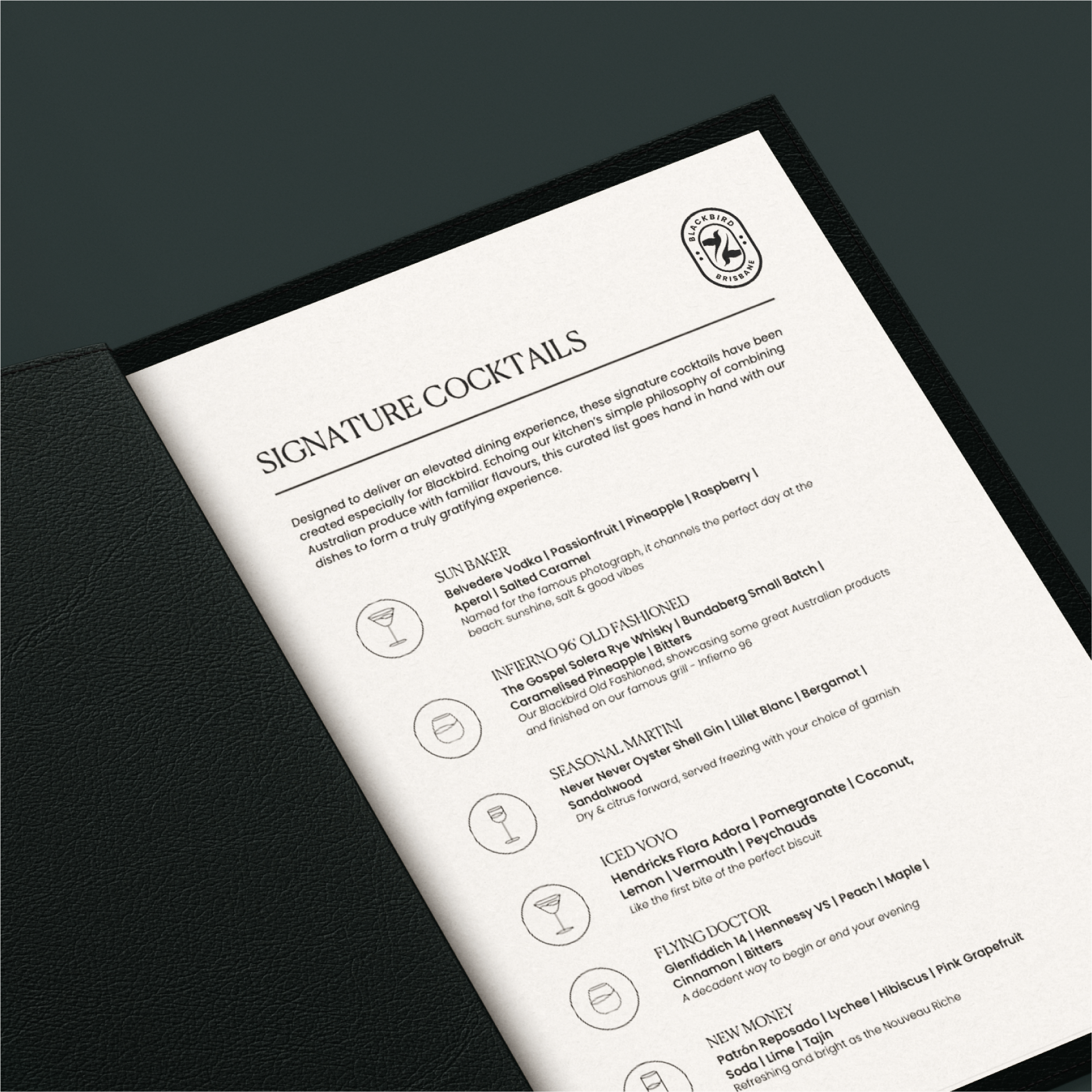
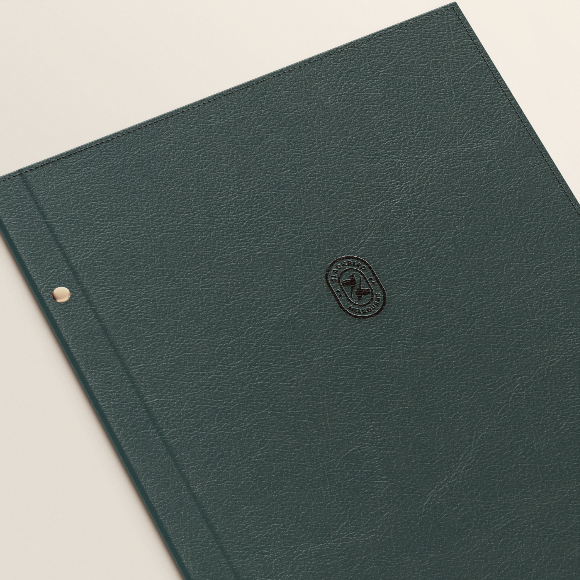
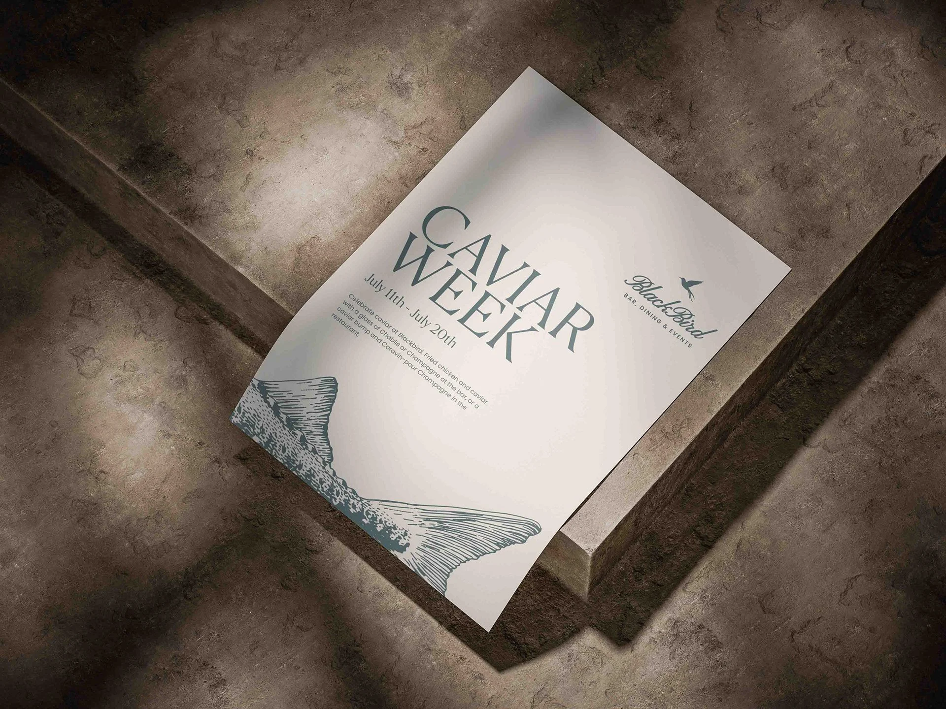
A darker, more atmospheric identity for a premium Melbourne venue.
The Blackbird Melbourne identity gave the venue a richer and more cohesive brand world — one that could stretch from signage and menus to event campaigns, while still feeling elegant, intimate and unmistakably connected to the dining experience.